

Creative Art Director | Brand Identity | Logo Design | Packaging Design | Product Line Development
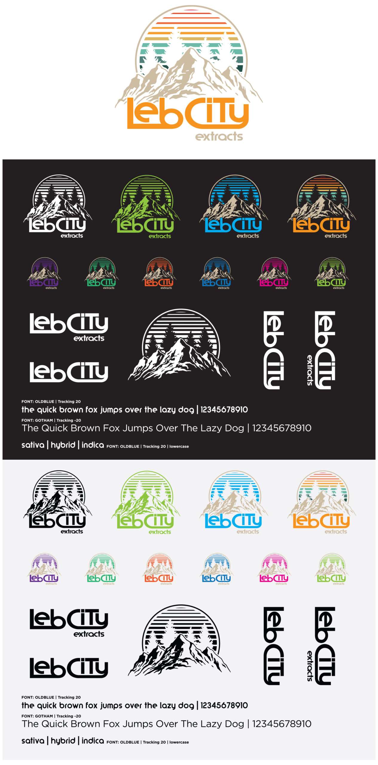
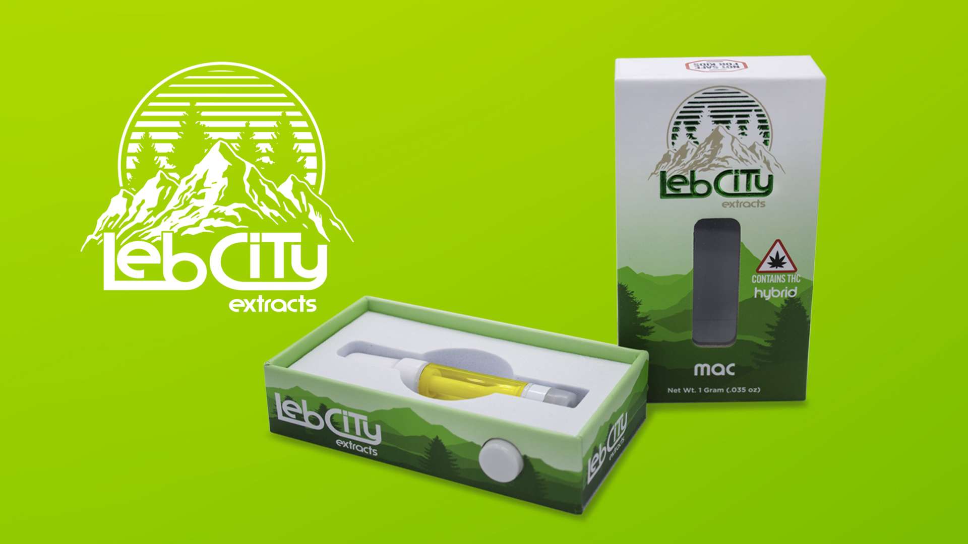
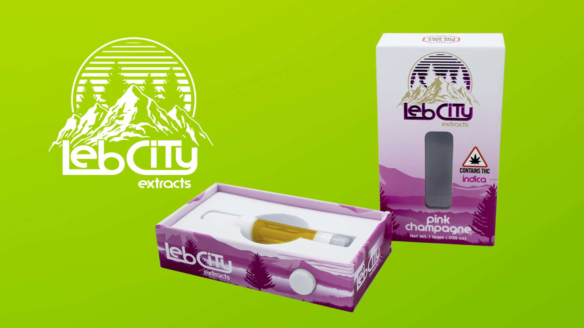
Leb City Extracts, a division of Leb City Greenery, needed a distinctive visual identity that could extend across its growing line of cannabis products. I developed the brand from the ground up, creating the original logo, visual identity, typography, color palette, packaging architecture, and brand standards to establish a consistent and recognizable presence across the product line.
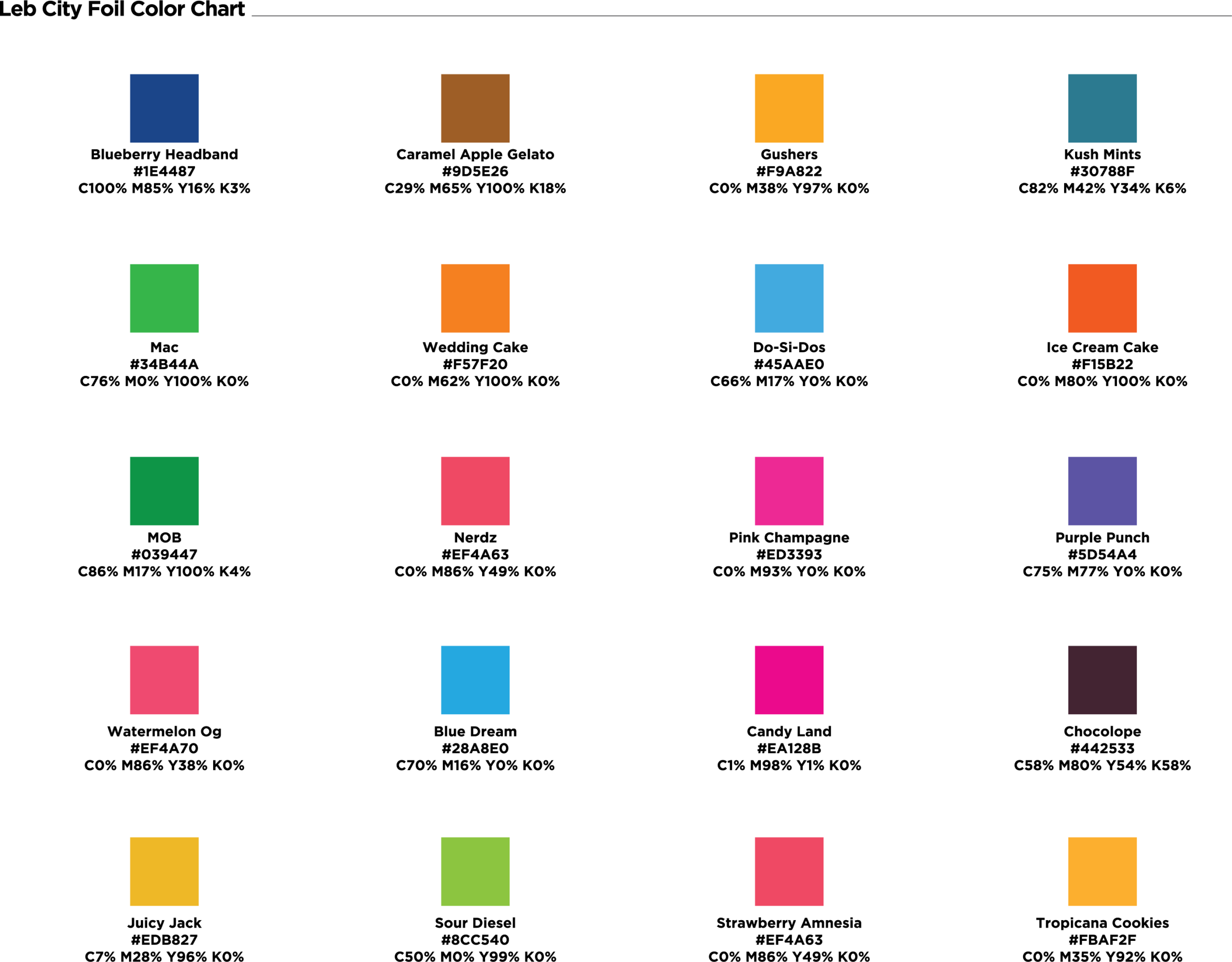
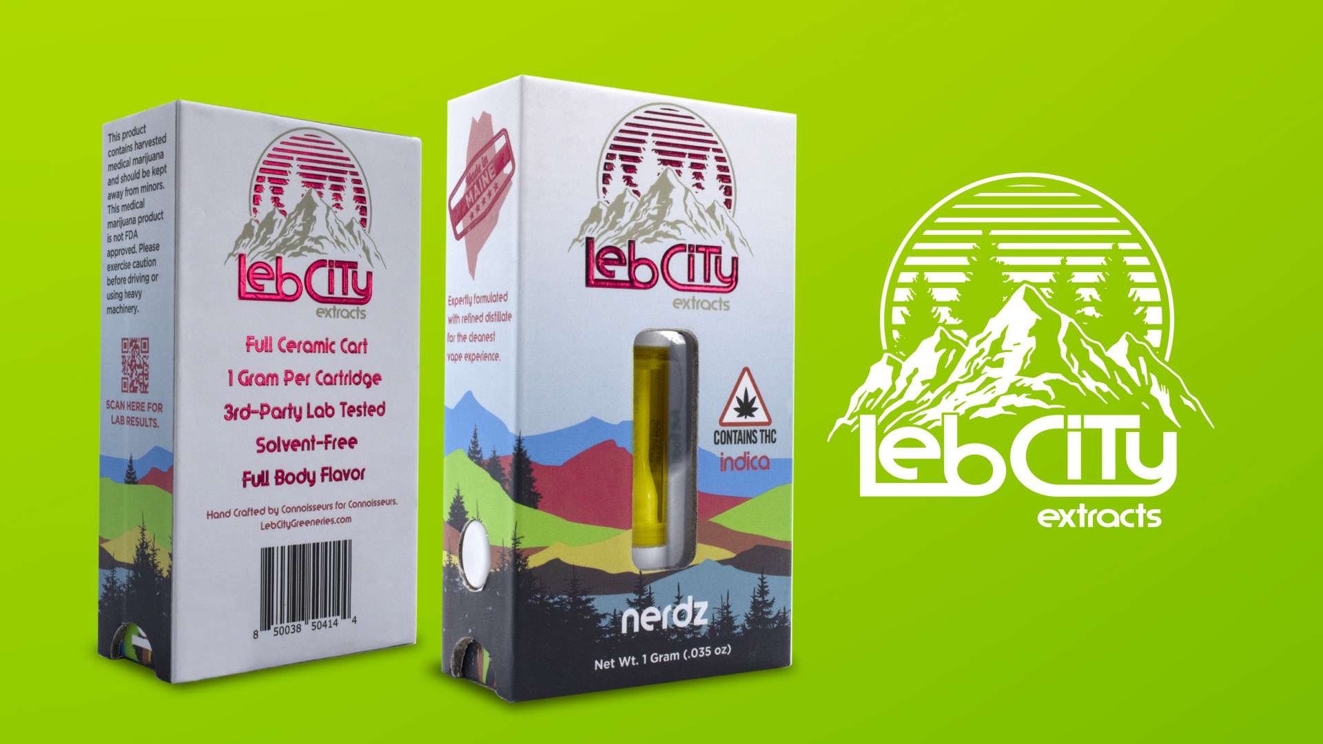
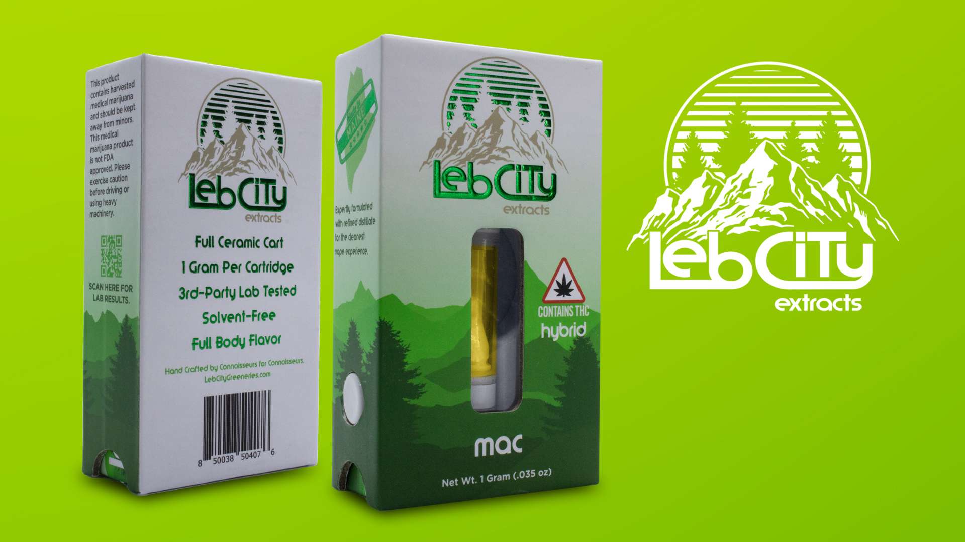
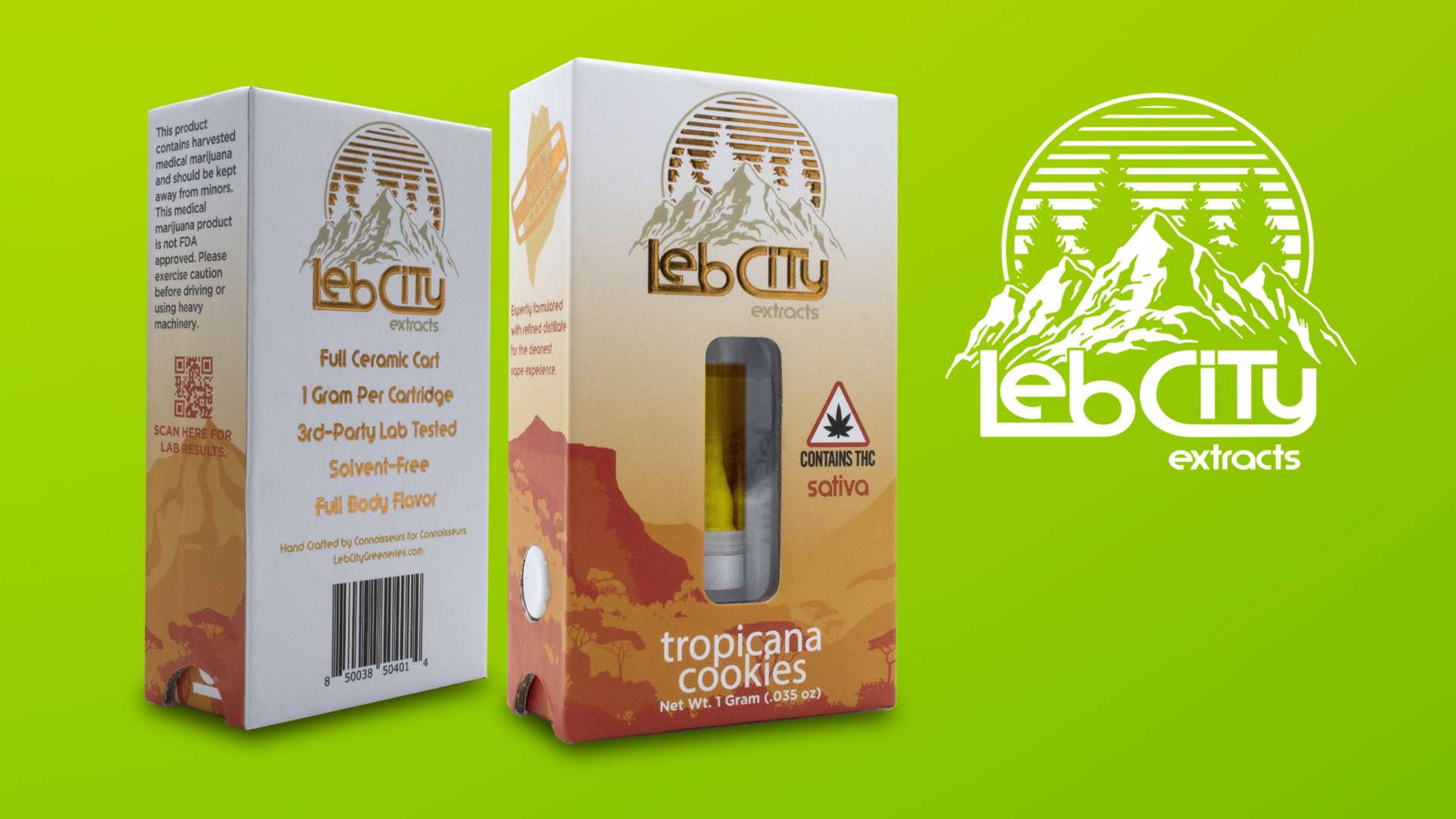
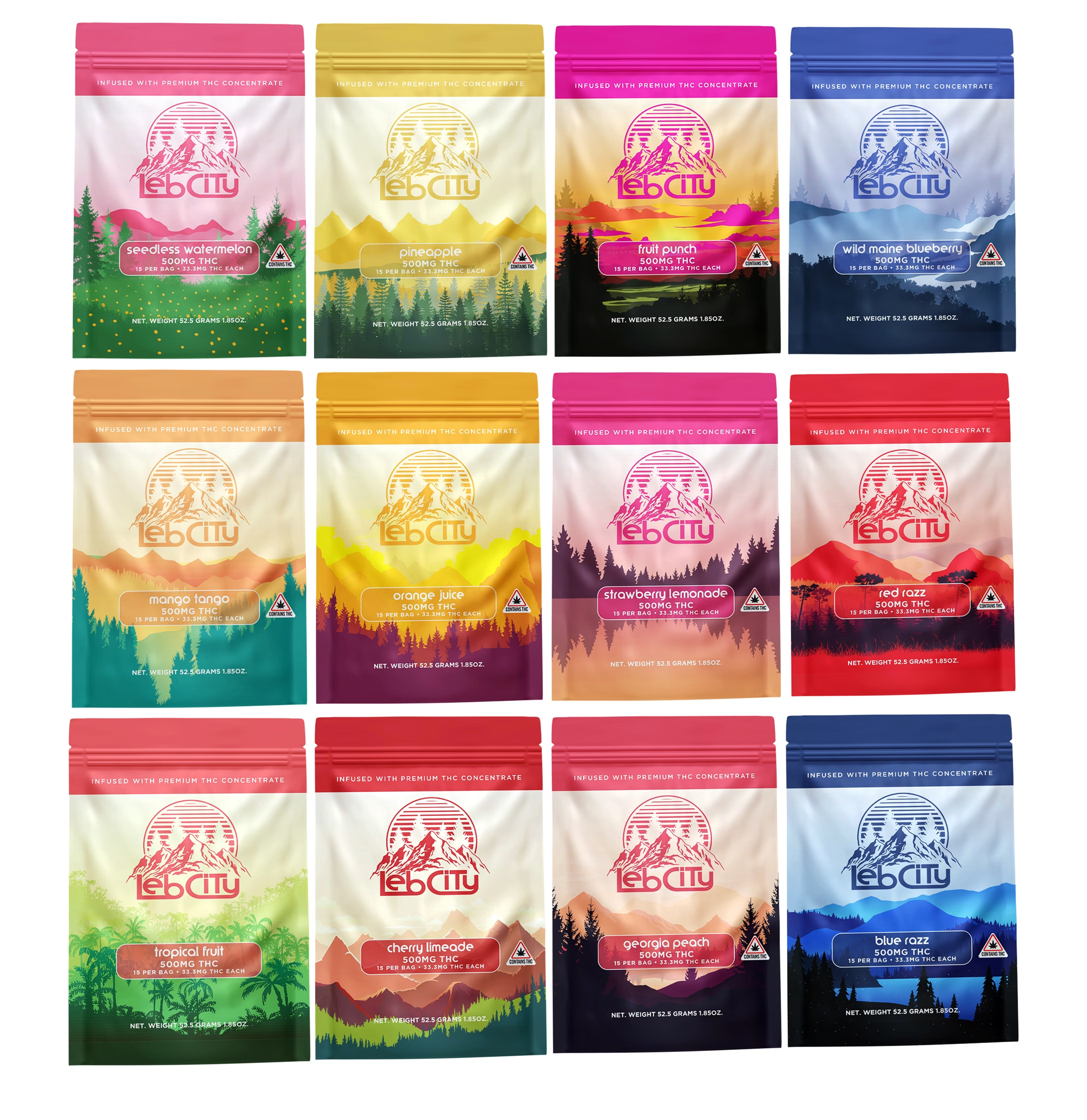
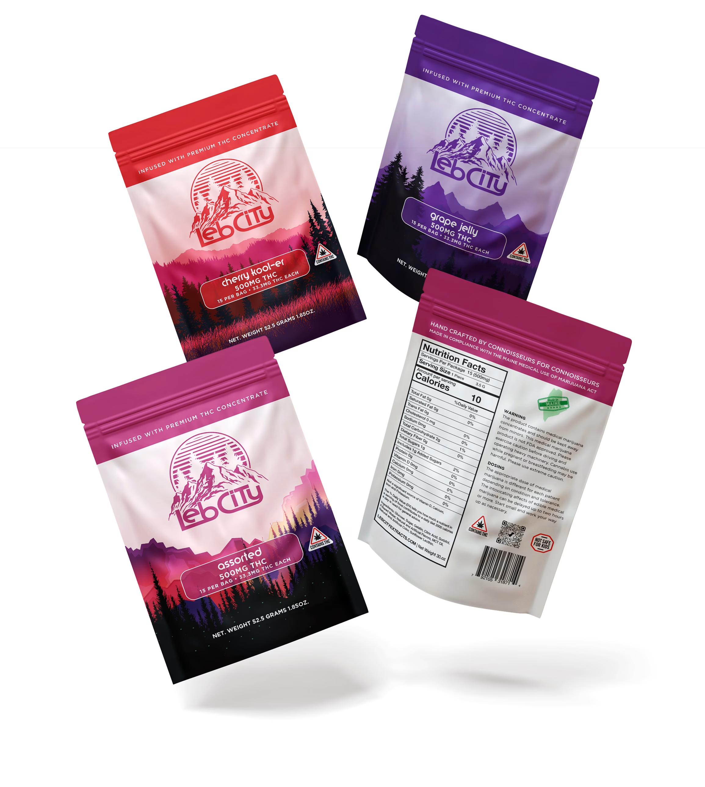
Inspired by the landscapes and terrain of Maine, I created a visual language centered around mountain imagery, natural forms, and a flexible color system. This approach allowed individual strains and product varieties to maintain their own personality while remaining immediately recognizable as part of the same brand.
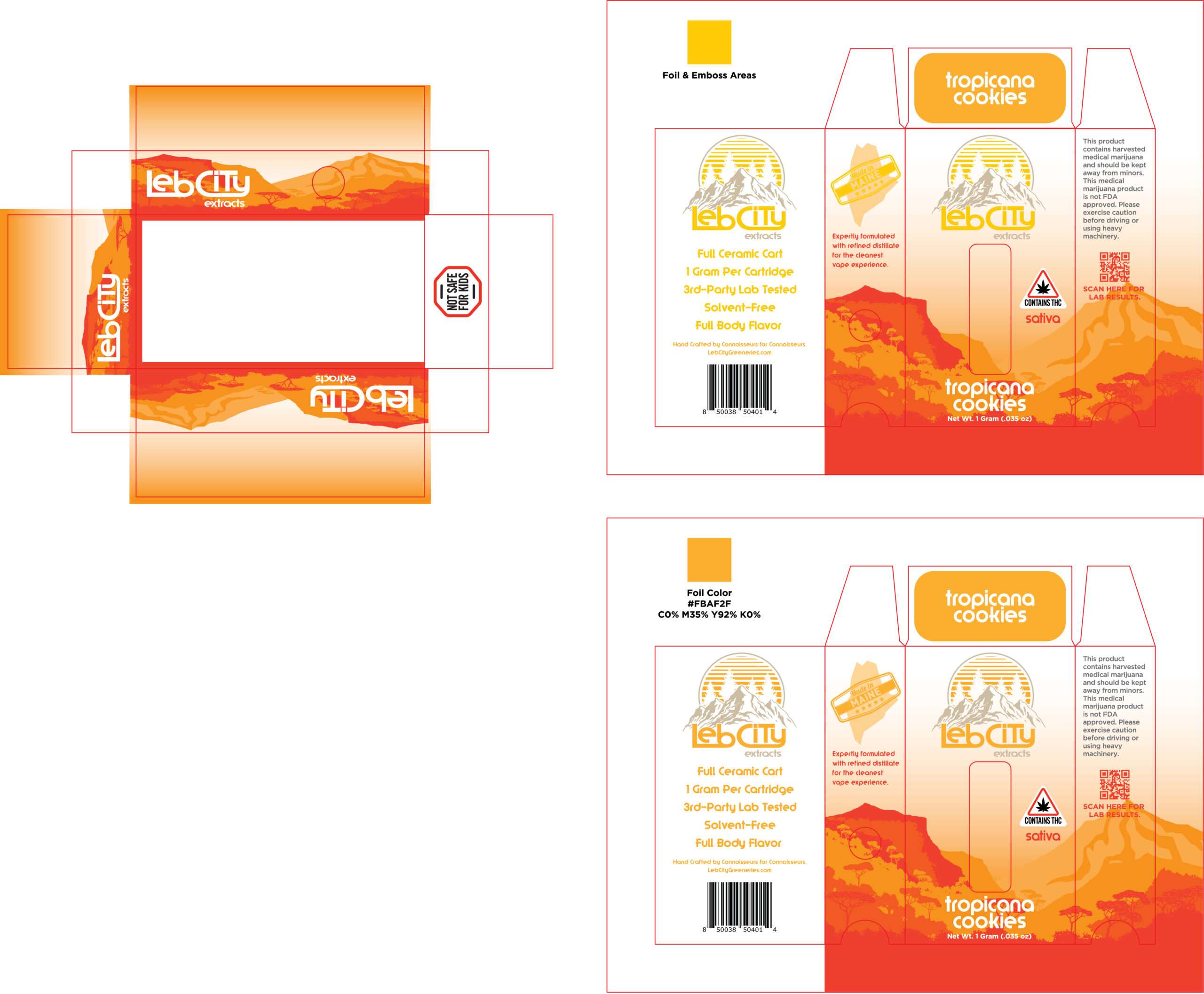
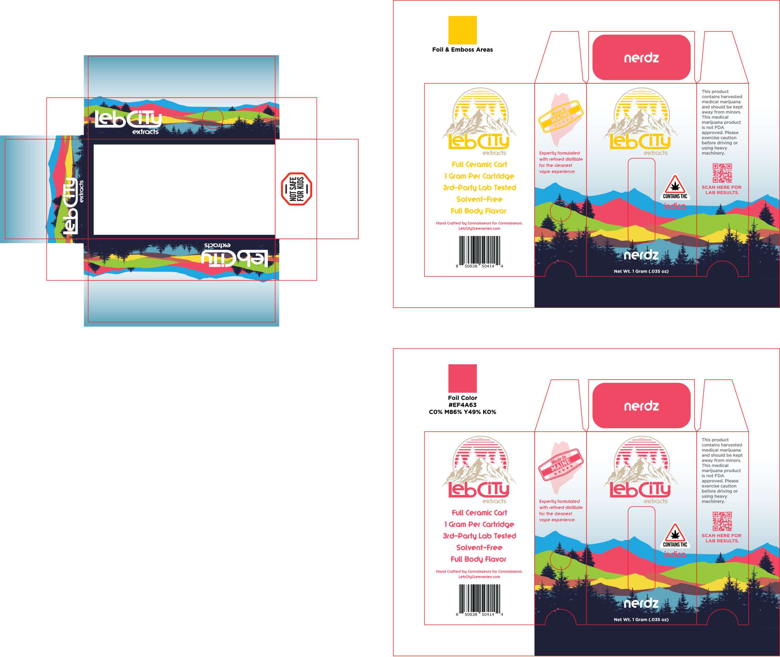
As the product line expanded, I extended the identity across cartridge packaging, pouches, strain and flavor variations, and additional product formats. From initial concepts and packaging design to production-ready artwork, dielines, and color specifications, I developed a scalable system that could accommodate new products while maintaining a cohesive retail presence.
The result was a comprehensive brand identity that helped distinguish Leb City Extracts in a competitive market. The brand subsequently received second-place recognition for its outstanding brand presence and design—an achievement I learned about when the client shared a photograph of their award.




I’m available for new creative and marketing projects. Have an idea? Let’s bring it to life.